Wednesday, December 14, 2011
Monday, November 21, 2011
veryveryveryVERY rough sketch screen shot (don't judge my art skills)
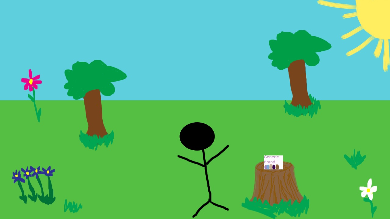
I want the stick person to be a actual person. and once again, I suck at drawing and this looks like a kindergarteners drawing. (mybad)
Wednesday, November 16, 2011
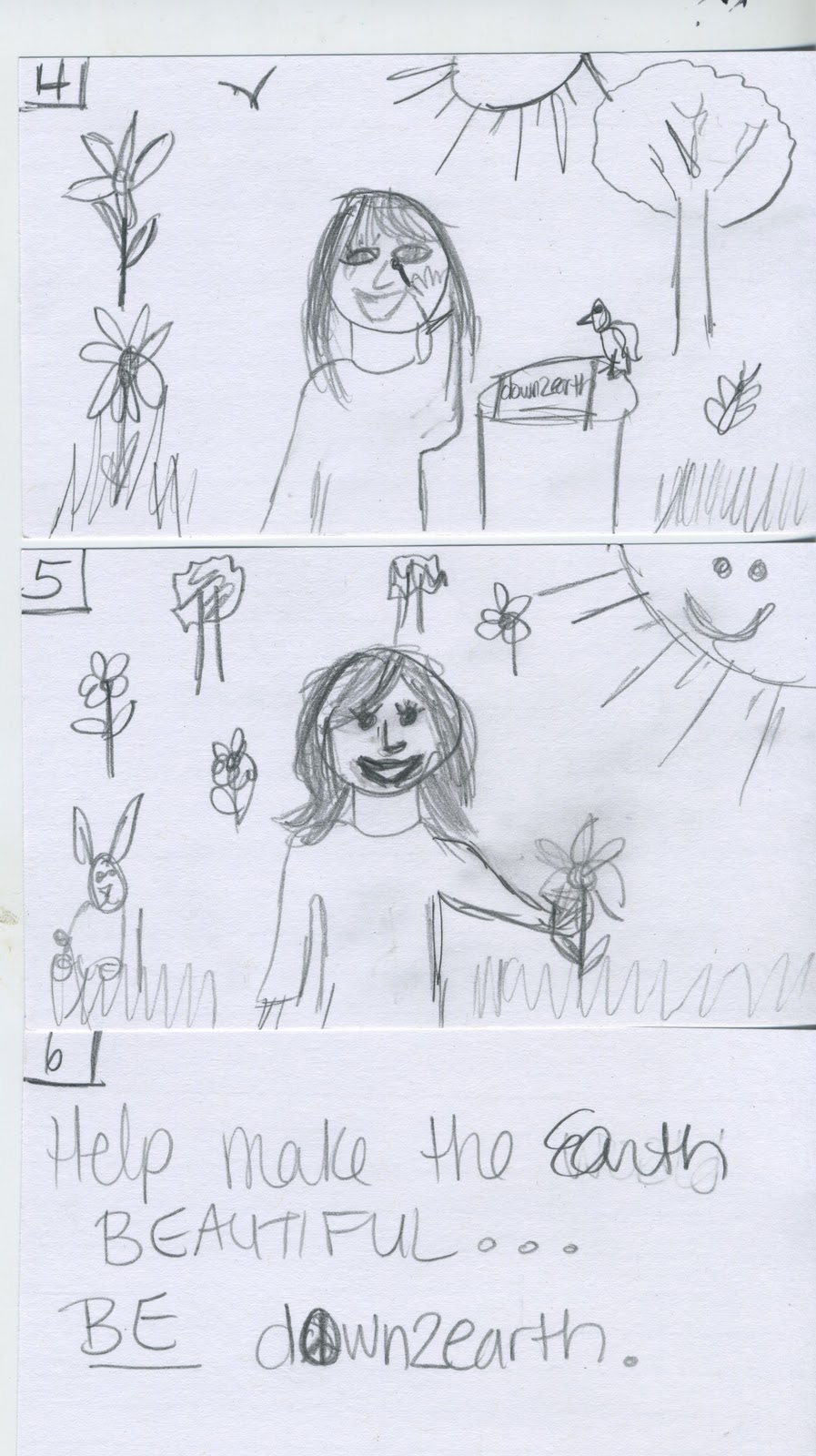
bored story....story board
I am a terrible drawer... so here's my attempt at drawing a girl w/ a dying forest... then a blooming forest and she is suppose to look prettier... (i think i may use actual people in the commercial)
please don't be frightened by my drawings... actually i was frightened so its okay.


please don't be frightened by my drawings... actually i was frightened so its okay.

Tuesday, November 8, 2011
Commercial Ideassssssssssssssssss ssss ssss sssssss sss (sss)
1. A cartoon of a tree growing and the Earth all green and healthy. Basically, showing a tree growing (sped up) then a further view of the Earth looking how it should (green and blue) with a catchy slogan like "help the earth become beautiful just like you, be down2earth."
2. A girl will be applying regular make up on in a darker lit forest, then another girl will put down2earth make up on, and everything will bloom, animals will come out, and tree's will smile. (cartoon)
3. "Forget those ingredients that you can't pronounce. Treat your body with something natural." A girl taking a blush brush dabbing it on a flower and putting it on her face to symbolize that the makeup is made from the earth.
4. 2 women - 1. using a regular brand of makeup that is not ecofriendly or organic and her makeup and hair will look terrible... the other woman will be using down2earth and she will look fresh and natural.
5. "be apart of nature without going into the woods, use down2earth." show a girl using down2earth and feeling like she is in nature?
i don't know. i'm really not creative at all. so any ideas would be much appreciated. thanks.
Commercialsssssssss
Old Spice
This commercial is hilarious and is selling men's body wash. It shows how fabulous a woman's life could be with a man that smells like Old's Spice. It shows women what their men could look like and smell like, aka hot! I believe the commercial is definitely effective because it's such a unique, humorous storyline. It's targeted at men in their teens - 50s and its targeted at their significant others that want them to smell good and look good.
E*Trade
These commercials are hilarious and definitely eye catching. A talking baby with an adult's voice, who wouldn't love it! The tone is obviously humorous and light. It makes some thing serious such as investing and makes it funny and appealing. I definitely looked into more commercials about E-trade after seeing this one. If I bought stock or did investments I would definitely do it with E-trade because of these commercials, therefore I think they are successful.
Sienna Swagger Wagon
This commercial is selling a family van, the Sienna SE. It targets families, specifically pre-teens/ teens since they are more familiar with rap. Its tone is extremely funny. I believe this commercial is successful and makes you consider buying a van if that's what you need for your family because it provides many examples of what it does. The commercial solves the problems that parents deal with with their children.
Geico Gecko
The Geico gecko commercials are always funny. I don't feel like I should get their insurance. The tone is happy and interesting. The visual style is animated with live action of people. The target audience is people who can drive.
Kia Soul Hamster
This commercial is selling a car, the Kia Soul. Their target audience is all ages up to the elderly. The tone is happy and fun. The visual style of film is animated hence the dancing hamsters and robots. I don't think the commercial is successful, but it is appealing. It catches my attention but I do not feel more obligated to buy a Kia Soul after watching it.
Wednesday, October 26, 2011

Tuesday, October 25, 2011
HEADERRRRRRRRR... CHYAA BOY.

I decided to just use the logo in the header w/ a simple design w/ green in it because the company is about going green. I made it sort of like a press release because I think the header/footer format for those look good. I provided the information that I have on the business card w/ the addition of the website on the bottom of the page. Like all my other projects, I wanted to make this as simple as possible, while still capturing the customers attention. Business letters do not need to be gaudy with a lot of design because they are strictly for getting out important information about the company, therefore I think this design works.
Subscribe to:
Posts (Atom)